Science fiction, fantasy, & horror - web design, graphic design, interactive media development by greententacles
![]() 2025-04-24 GMT
2025-04-24 GMT
Science fiction, fantasy, & horror - web design, graphic design, interactive media development by greententacles
![]() 2025-04-24 GMT
2025-04-24 GMT
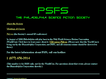
For the most part the old website consisted of green text. It was purely functional, although reports from the general membership seem to indicate that it was infrequently updated. It gave the basic information needed for people to find out about the Society.
The original site looked like this:
The primary goal of the site redesign was to design it so that it could be used as another point of contact for members. The secondary goal was to publicize the PSFS group, and bring in more members to the society.
The intended audience for the site was science fiction fans (skewed towards literary science fiction). It also has to accomodate the entire current membership, which spans every age group and level of technological experience. The youngest member of the group was 13 years of age, while the oldest members are in their 70's and 80's.
Having been warned that the membership was generally adverse to change we took every precaution to avoid any problems. We did the site using static HTML, no javascript, no flash - so that the general membership would not have to upgrade their browsers, or download a plug-in to view the site. The idea was to make the site as accessible as possible, regardless of how old a computer platform or browser that someone could be using.
We went through the basic steps of approval for a site design process. Those steps are Site Structure Outline, Architectural Design, Layout Grids & Stylistic Design, Prototype (beta version), Site Launch.
Since it was a redesign of a small site, the outline and flowchart steps were easier to do than in most other cases.
Site Structure Outline:
The pages of the site consisted of the home page, the events page, the guests/meetings page, and a link to PhilCon (the society's convention site).
Having built the scope, and getting it approved by Hugh Casey, the President of PSFS, we began on the design.
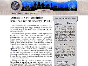
We wanted to go with a retro/techno-worn sci-fi look, to stress the age of one of the oldest science fiction fan groups in the world while still maintaining a technical look and feel to the site. We wanted to stress both endurance and high technology.
The approved design looked like this:
It's a small site with room for growth.
The Philadelphia Science Fiction Society was easier to deal with than most other organizations, in my experience. Everyone seemed pleased with the initial outcome, with the only request being to make the buttons 'a little larger.' There wasn't any hemming and hawing over the design. Whether that's a tribute to the ease of working with PSFS or to our design skills we can't really say.
Even though we took every precaution from the beginning, we were still surprised that there weren't any problems (complaints, criticisms, eetc.) after the design was launched. The single most amazing point was that we didn't alienate any of the people who were currently using the site.
We continued to receive rave reviews from the society members about the site.
In the words of Hugh Casey, the PSFS president, "The one person who I really thought would have a problem with changing the site, looked at the design, and said,'Hey! Cool!'"
To see the working site visit psfs.org